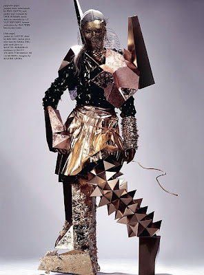
Below is my most recent work, a set of add campaigns style images for an amazing Italian designer named Kristian Aadnevik. This was a great opportunity for me because his pieces are super sexy and glamorous which is very different from what I'm used to working with.
In seasons past Kristian has opted for the "edgy chic" look - Black background, super hot girls, lots of eye make up, long straight hair - and although his previous campaigns are beautiful, i thought he could use a bit of a refresher. I chose to take the focus away from the model and place it on the mood of the location and the graphics, in an effort to inject some "cool". The final product is all about the contrast between an image shot in studio vs. on location.
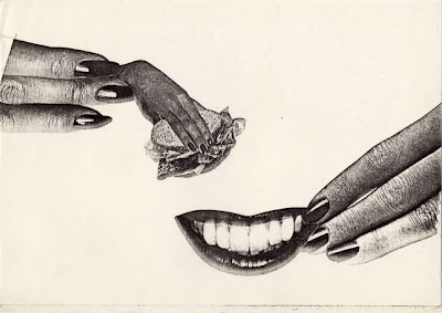
I must admit, my inspiration came from the spring 2011 Topshop campaigns. The adds are all double page spreads of the same two models shown in the studio on one side of the page and on location on the other. The girls are wearing different things in each shot but the colors and the mood bring it all together. Upon seeing the adds I immediately thought it was a really smart use of space. The Juxtaposition of the atmospheric and full, if you will, location shot next to the classic clean studio image forces you to actually look and question what's in front of you - Why are those two images next to each other - Ultimately, i think this is a great trick as it really holds your eye and that's what every campaign is aiming to do.
In addition to doing the production, styling and graphics for this shoot, i decided to make a short film to accompany it. It's super rough around the edges as this was my very first experience with moving image, editing etc. Beyond acting as a vehicle for me to get comfortable with the medium, the film has no real purpose. It's mostly about shapes, contrast, and the music. Enjoy (i hope!).
Styling|Olivia Crouppen
Hair and Make-Up|Lucy Kwatchey
Hannah @ Tessa
To see more of Kristian Aadnevik's pieces click here


